
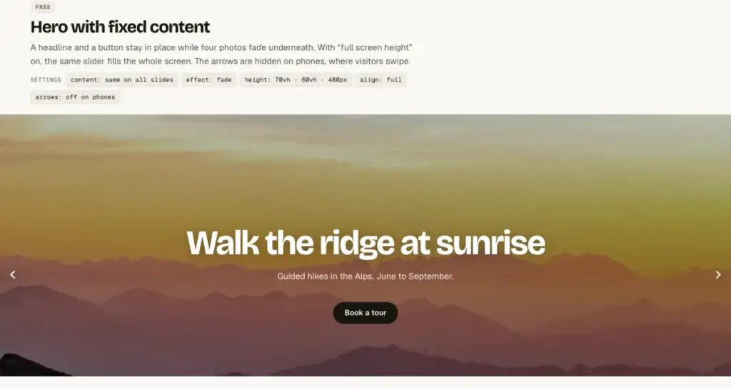
A fullscreen background slider fills the whole screen with photos or video, with a headline and a button on top that stay in place while the backgrounds change. With Gutenslider it is one block and three settings, all in the free plugin.
Build it in four steps
- Add the Gutenslider block and pick your photos from the Media Library; each one becomes a slide. Use images at least 1600 px wide.
- Set the alignment to full width in the block toolbar.
- In the slider’s Slides panel turn on Full screen height. The slider now fills the height of the screen on every device.
- Set Content to Same on all and add a heading, a short paragraph and a button. They stay in place while the photos change underneath.
For the calm look of a hero, choose the Fade effect in the slider settings. Press Preview in the slider’s toolbar to see it move in the editor.
Almost full screen
A slider that fills the screen completely hides the rest of the page; visitors may not notice they can scroll. A minimum height such as 80vh leaves a hint of the next section. The height can differ per device: the example uses 70vh on desktop, 60vh on tablets and 480px on phones.
Keep the text readable
- Give each slide an overlay: a dark color at 30–40 % opacity behind white text works on almost any photo.
- Set the focal point of each image so faces and horizons stay visible when phones crop the photo to a portrait shape.
- Turn the arrows off on phones; visitors swipe there, and the arrows would sit on the text.
With a video instead
Any slide can have a video background instead of a photo, muted and looping. See Full-screen video background slider.
Fast on the first screen
The first image of a hero slider is the largest element on the screen, so Gutenslider loads it with high priority and the others lazily, with a srcset that sends phones a small file. The layout is in the HTML before any script runs, so nothing jumps while the page loads.